
By Abi Safago, Reporter
Photo courtesy of aqsaints.com
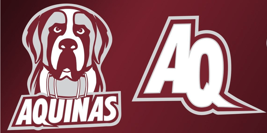
This summer, the Aquinas Athletic department announced they had a new logo. Many students (current and past) were not a fan of this unfamiliar Nelson. Others, however, have become fans.
For many students across campus, the changing logo raised some concerns. They were concerned with how the college paid for updates, why the logo was updated, and also why the classic Nelson didn’t quite look the same. Many students also raised an eyebrow as to why the beloved Saint Bernard suddenly had a keg or barrel around his neck. This new look is about so much more than the dog we all love.
Student feedback: The good and bad
Many students were upset about the changes made to our logo. Why? Nelson not looking like himself, the barrel around his neck and the new turf on the soccer field have left “weird vibes” as some would say. One former student-athlete has strong feelings about the unexpected change.
“The logo is not good. I am extremely disappointed that there was no opportunity for student input or even the potential for a student design to be utilized. In addition, this is a very costly change for the college —there has been such an intense focus on athletics lately when the entire college is struggling financially.”
They weren’t the only one feeling this way about seeking student input though. Another topic that was trending on the concern with the logo was the “keg” around Nelson’s neck.
One anonymous student believes that “the barrel should not have been included because President Quinn stated that it [Aquinas] is a dry campus…The new logo kind of states that there is alcohol on campus.” This concern is easy to understand, as not all students participate in activities having to do with alcohol consumption.
The last major concern students had was about the money being spent. Many wondered if it was an impulsive decision to revamp Nelson. A few students said they would have preferred if the athletic department would have polled on logos to see what the student body thought. Maybe there was a different logo that could have worked better.
Despite all of the negative comments, the athletic department isn’t worrying much about it.
More than the looks
The athletic department consciously made the decision to revamp and redesign our beloved Saint Bernard for many reasons. From the first conversations 18 months ago, this project has come a long way. It can be hard to recruit future students, as we are just the school with a dog in the logo. Fixing things up and making the athletics logo unique sets the program apart and makes it more recognizable.
The past logo of Nelson, which many of us know to be a familiar face, is not a Saint Bernard. In fact, the old logo featured a Bulldog as its inspiration and original design. A part of the new design of Nelson was to have an actual Saint Bernard represent the Aquinas Saints.
Part of the new look includes a keg, which many people are upset about. However, DJ Foster, the Assistant Athletic Director, says it means something far different.
“Saint Bernards are service dogs. If you search ‘Saint Bernard’ and look at the pictures, you’ll see the barrel on its neck. The fact that it is considered a service dog is why we included the accessory—it ties into one of the school’s [Dominican] pillars. It’s not about drinking at all, it’s about tying our logo back to its roots.”
Another reason the athletic department decided to “come fresh” with the logo is to rebrand the athletic program. Years ago, our athletic programs all wore the same basic design—red and white with the Saints logo. The issue was that many of the reds were different shades and even the brands were different.
“Nike, Adidas, New Balance…our teams were sporting a little bit of everyone. It just made sense to establish a brand so our teams look consistent.”
Foster also says that rebranding wasn’t very costly. By using one brand for all the teams, they get major discounts on the gear, clothing and practice materials needed.
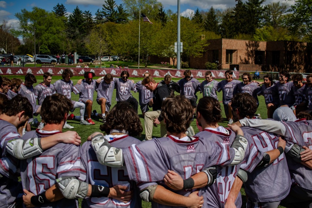
The weirdest, but also most efficient timing the logo’s debut had, was with the new soccer turf. The previous turf on the soccer field had been there for nearly 10 years, which after such a long time (and so many winter storms) wore the track down intensely. For athlete health, it was best to replace the turf this season.
“It was time to update the turf for safety reasons. When we realized that our design team could finish by then, we pushed for it. It only made sense to put the new logo on the turf if we were already updating it.”
A look to the future
While it is going to take a while to get used to our new, more authentic Nelson, this look is staying.
This new rebranded look is going to be a staple for the athletic department for a while, especially because they want to get the most out of this new look.
“It’s going to take a little bit to get all the teams to be consistent in gear for their seasons, but in the long run, our 600+ student-athletes looking like teams for the same college is going to be great. It’s a big step into the future for us.”


Leave a comment